Bee Delivery
Introduction
The goal of Bee Delivery is to help its partner couriers increase their profitability, reward their performance and initiative, and help businesses make more efficient and flexible deliveries.
The problem
Founded in 2017, Bee Delivery gradually expanded across the country. In 2020, there was unexpected growth due to social isolation caused by COVID-19, increasing the need for delivery services. With the rise in demand, new couriers joined the platform, enhancing the support service provided to couriers by the company. To better understand the problem, considering that the average service time is 15 minutes and the average delivery time is 30 minutes, we concluded that after two support services, the company would lose the profit of one completed delivery. Thus, the question arose:
"How can we improve the delivery process for Bee's couriers? Enabling them to make more deliveries and contact support less often."
What they had before
Before we started designing and creating any strategy, I thoroughly researched the existing platform, how it worked, and which areas were the most complex. I also conducted a survey with the current app users.
This was the app before the improvement updates:
First steps
My first step was to find out what data we had and how it was being used. Observing the data, it was found that 75% of support calls from couriers were aimed at “Finalizing deliveries.”
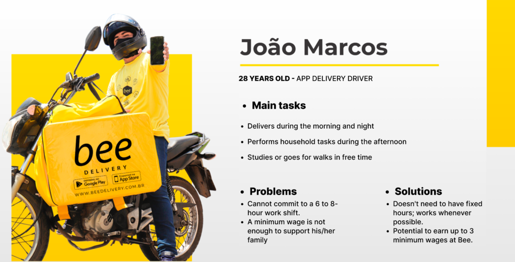
Since it was an app already in production on the market, I decided to run a usability test on the current app to understand what might be generating this demand. To do this, I collected information from our couriers in the company’s database and created a persona with the main characteristics of our users to recruit candidates with a similar profile for the test.

Second step
In this first test, since the goal was to understand what caused confusion, the task was to complete the entire delivery flow, which consists of five steps:
- “Accept the Delivery”
- “Arrived at Origin”
- “Leaving for Destination”
- “Arrived at Destination” and
- “Delivered.”
After conducting usability tests with 3 users, mapping the user journey, and identifying weaknesses, motivations, and frustrations, I gained a clearer view of the main causes of problems in the app’s delivery journey, which are listed below.

Poorly positioned step button
The check-out button for the steps was hidden and only appeared when the card was expanded.

Too much unnecessary initial information
After accepting the delivery, too much unnecessary information was presented, confusing the courier.

Lack of visual standards and hierarchy
Mixed information. Important texts were placed among buttons, with button-like formats, but they were not actually buttons.
Solution
The main challenge of this project was the limited time available for development due to the urgent need for improvements, while also minimizing the learning curve for active users who had been familiar with the current app for 3 years. Therefore, the UX aspect was crucial, involving interviewing and testing with users to understand what really worked, avoiding previous mistakes, and reducing support calls.

Improvements
Since the button was hidden in the card and required scrolling to be seen, many users did not check out the steps, preventing them from completing a delivery in the app. To solve this issue, we made the button float so that it was always visible on the screen, indicating to the user that they needed to click it to proceed with the delivery.
In the old version of the app, when the courier received a delivery, all information was displayed at once, including details that were not necessary at that stage of the journey, confusing the user. To address this issue, the app now displays information according to the delivery progress button explained in the card above. For example, the origin address will be shown only while the button status is “Heading to Origin.”
In the old version of the app, there was no textual hierarchy or standardization of buttons. For example, when the user opened the initial card, there were 4 buttons in the same location and format, making it difficult to understand which button was the most important. In the new version, we repositioned the buttons, organizing them by topic and leaving only the main button at the bottom.
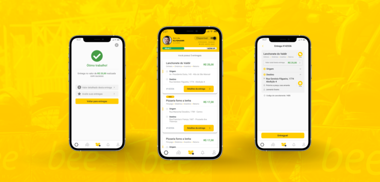
Final product
The final product underwent many changes along the way, but it was all a result of very thorough user research. The design was entirely user/delivery-person-centered and, based on the data, allowed us to create new features, reorganize key elements, improve the delivery process, and increase the number of daily deliveries.
Learnings
Being very honest, it is difficult to quantify how much I have learned from this project so far. Working day by day with a support team and understanding their challenges to create digital solutions that address their problems and those of the delivery personnel has been incredibly enlightening. Now, I am waiting and closely monitoring the development team as they finalize the product, so we can conduct production tests and see if our goal of reducing support calls by at least 25% will be achieved.

